Before starting my realisation of concept, I watched many tutorials on using the Adobe software’s: Illustrator, Photoshop and After Effects. Although I already have basic knowledge of these, it was necessary to carry out further research to improve my skills and abilities. I used a 10 day free trial on Lynda.com and looked at a lot of tutorials, mainly using After Effects. These demonstrated a lot of new skills (basic and advanced) to me that I put towards creating my animation video and digital posters.
In order to make my video look professional and engaging, I used a speciFIc colour scheme and neat looking visuals. I created all the graphics for my video on either Photoshop or Illustrator, exploring the tools and shapes provided to make them interesting and consistent in style.
I looked at the “Innovation of Loneliness’’ video by Shimi Cohen for most of my inspiration as on Lynda.com, Eran Stern has made several tutorials explaining some of the steps to creating the video on After Effects. I mainly learnt how to create interesting shape animation and artistic ways to reveal text using masks.
Because I had created a storyboard and narrative before I began creating my animation video, it made the process a lot smoother and easier for myself. With only small changes to my storyboard, I was able to create separate assets and compositions to make up the video.
When it came to putting it all together, I knew exactly what the order was and roughly how long each one needed to be according to the speech that matched it. This meant when it came to recording the voiceover, not much editing was needed to match it all together. I used Premier Pro to edit together the voice over and royalty free music with the animation.
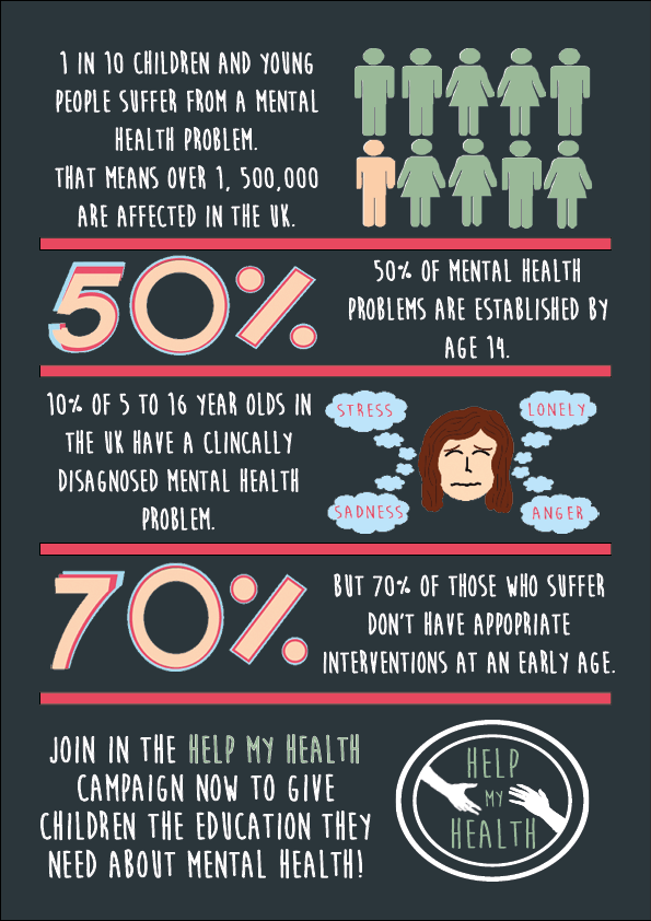
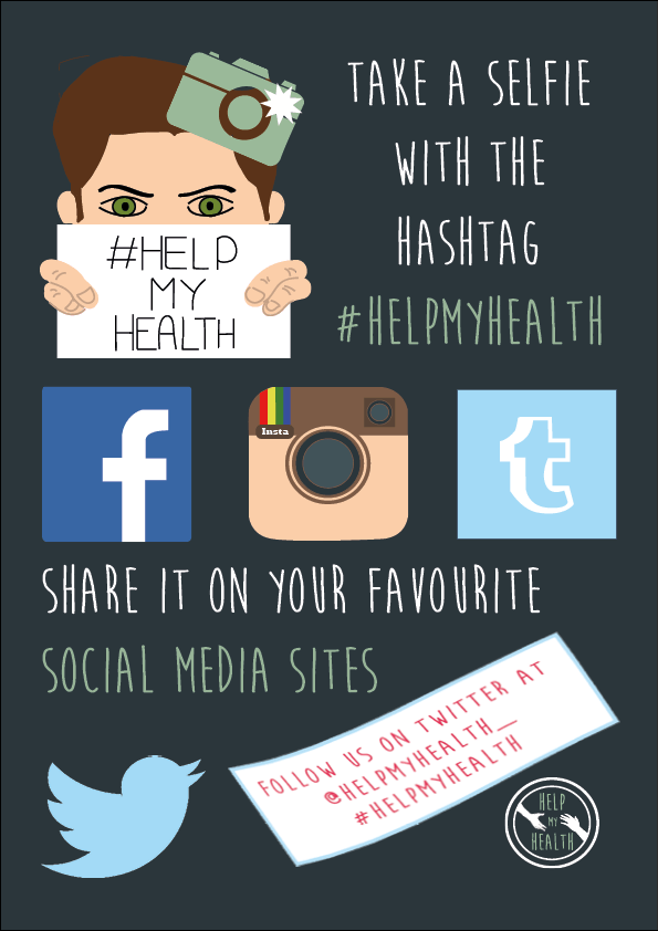
As the main concept for my project, I focused a lot of my time on animating the video on after effects, which took me a lot longer than I anticipated. Unfortunately, this left me with not as much time to create the posters. The posters consist of the information displayed on the video, emphasising the importance of the campaign. Created on InDesign, the posters have a professional layout and display, complimenting it with a consistent colour scheme and graphics. I regret not giving myself more time to create these posters as I feel I could have been more imaginative with them.
If I were to do this project again, I would push myself to explore software’s I hadn’t used before, such as Adobe Muse or Adobe Experience Design to create a website or app prototype. However, because my project was a campaign to bring mental health education into the national curriculum, an animation video and posters were the most appropriate outputs to create.